When entering, the introduction wall immediately sparks an interest by sharing exhibition information through lively graphic treatments. As if I wasn’t already excited to see the work on display. A map of Houston is constructed of pegboard, string and tape, which speaks to the idea of a progressive cultural identity.
In the first space, projects are displayed at eye height along the walls. In the center, hanging lamps cast clarity on the tables that hold the designs for a tactile experience. The work consists of excellent branding solutions to be investigated, websites to be navigated, and print materials to be deciphered. I enjoyed the ability to flip through booklets and trace various textures because it created an interactive experience.
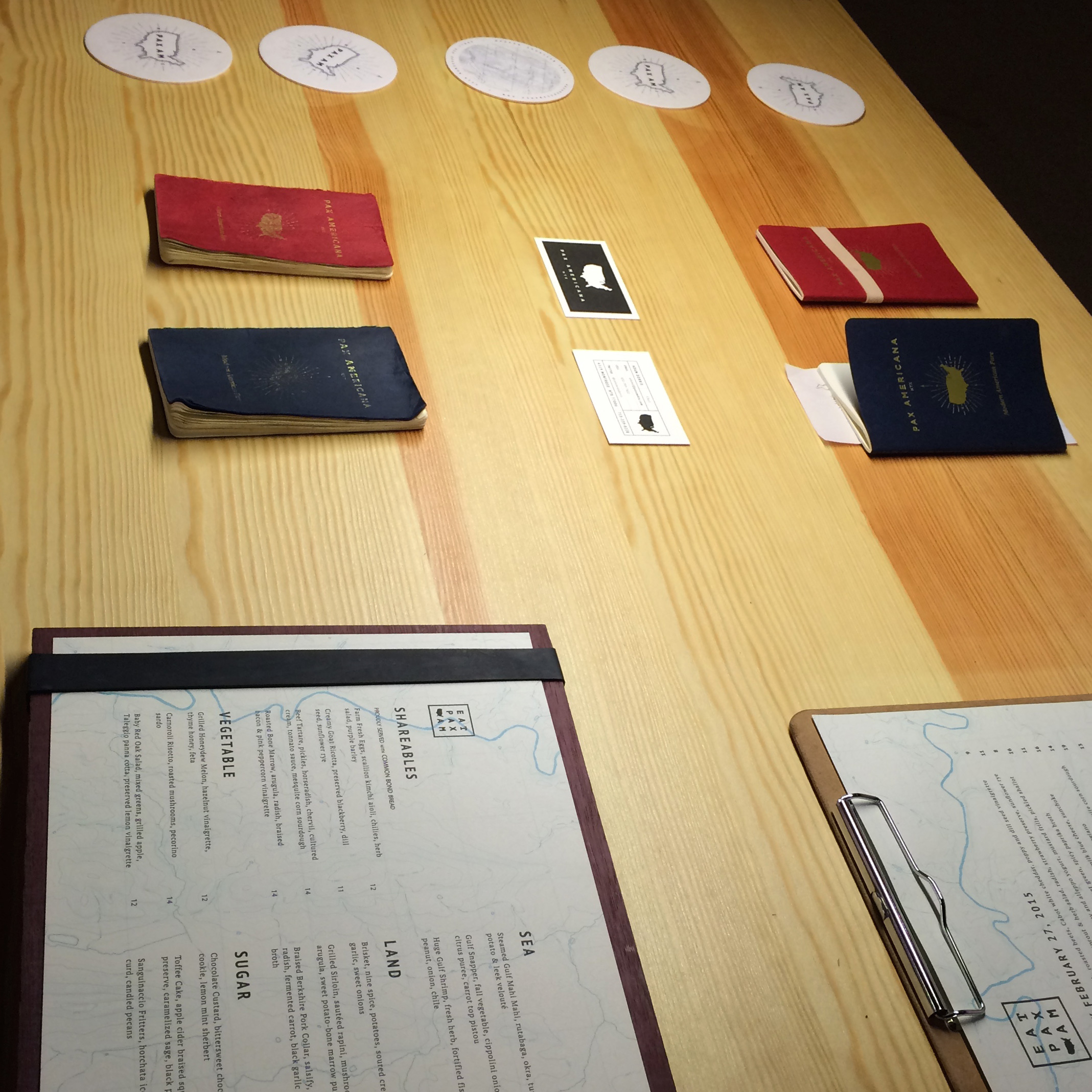
 There is no question of quality of the work displayed. The Pax Americana restaurant branding quickly drew me in by its use of commonly found materials. Booklets fashioned like passports and geographical mapping serve as motifs of classic western adventure. Innovative materials were also used for the menu. What stood out to me were thick rubber bands reinforcing the menu on a block of wood.
In the neighboring space, logo and identity systems boast of cohesive excellence applied to various materials. The best explanation of this is Goode Co.’s rebranding, the existing logos were unified with a fluid mark paired with etching style illustrations. Having grown up seeing the previous logo marks applied, I was excited to see such a successful and seamless solution. The identity system is a refreshing take on the various food chains and honors the roots of the client.


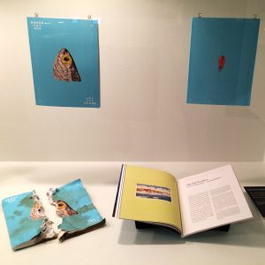 While separated by glass, display cases are occupied by publications and packaging. The editorial work for Sugar & Rice was thought provoking. Four copies of the independent publication are suspended as open and destructed versions lay below. I was incredibly intrigued by this display as the vivid design was juxtaposed – making the statement that the publication’s identity could not easily be tampered.