By far, the most educational and entertaining part of the website is Business Lynch, where people with varying levels of design skills send in work for critique by Artemy and his employees.
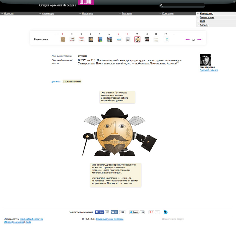
Below is an example from April 9, 2012:
If you’re Russian, you probably know who Artemy Lebedev is. For others, I should say he’s an eccentric entrepreneur who angers a lot of people with posts on his blog and owns the biggest design studio in Russia. While the English version of the studio’s website showcases their work, the original Russian site brings out the owner’s personality—it can often anger and offend the unprepared (Artemy is a huge fan of cursing), but is also a great source of design knowledge. It is, after all, where I was introduced to design and learned about kerning, leading, and numerous do’s and don’ts.

By far, the most educational and entertaining part of the website is Business Lynch, where people with varying levels of design skills send in work for critique by Artemy and his employees.
Below is an example from April 9, 2012:

A person under username student says: “Plekhanov Russian Academy of Economics held a contest among students for creating the university’s mascot. The outcome was published on their website, this is the winner. What do you say, Artemy?”
Artemy’s reply comes in the yellow boxes above and below the mascot, and says the following: “This is a masterpiece. Everything is good here—both execution and copywriter’s work are at the highest level.”
Now we go down to the lower box (with bold text I indicated places where juicy foul language was used.): “It seems to me, the design community was missing an example of a tremendously bad logotype. Finally, a perfect example has been found. This logotype is so awful that in a contest for the most awful logotype it would have gotten the second place because it’s so awful.”
At first, I treated these daily critiques as entertainment—there was something very satisfying in seeing bad design ridiculed. At that time, I had no interest in becoming a designer. However, over time, I noticed myself subconsciously critiquing design around me. Logos, websites, menus and business cards could no longer escape my eyes without judgment. Long story short, I’m now a designer.
I can say with confidence, that I am not the only person who was drawn to design as a career through Artemy Lebedev’s website. What his team did there is very smart—they created a site with design-related dynamic content that people are drawn to every day. More design studios should aspire to do something similar in order to grow awareness and appreciation for our profession.