Don’t Neglect Your Appearance (Panel)
 Adobe’s Illustrator is one of the indispensable applications in every graphic artist’s toolbox. At Herring, we use it to create charts, maps, logos, and navigational elements. Accomplished Illustrator users go on to create stunning, complex illustrations. The primary benefit to using Illustrator is because artwork created with it is in a vector format which, unlike Photoshop images, allows it to be scaled infinitely without degrading the final image.
When computers took over our industry, they allowed us the ability to easily explore options, revise documents with little effort, and quickly share files with coworkers and clients. But when a designer needs to work on an Illustrator file created by someone else, he or she can find themselves baffled when they open the file. Often that’s because they don’t bother to open the Appearance Panel, relying instead on the stroke/fill icon at the bottom of the tool palette only to edit the objects they see. The Appearance Panel is the most useful and overlooked panel in Illustrator.
Since its birth over 25 years ago, Illustrator has had two basic parts to every object – fill and stroke. Back then you could control only the color of each and the line weight of the stroke. Today’s Illustrator objects can have dozens of different attributes and effects combined in countless ways to produce an endless variety of appearances. Unlike much older versions of Illustrator these effects can be applied to objects non-destructively, which makes revising artwork extremely flexible.
Layering effects and anticipating revisions

Basic fill and stroke tools

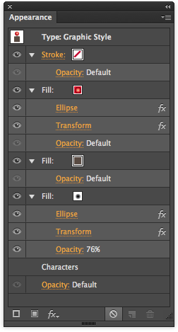
Illustrator CC’s Appearance Panel
Before the Appearance Panel was added to Illustrator it was often necessary to duplicate objects over and over, applying different strokes and fills to create a necessary appearance for a single item. Unfortunately, when the inevitable client change came down, that meant backtracking steps and redoing much of the work over again. This can get time consuming when an artist is dealing with a complex project, such as a map, where a single edit can affect hundreds of objects in one file. This gets even trickier when objects need to be copied or moved since it makes it difficult to select all of the objects that make up a single item especially when they are stacked on top of one another.
With the Appearance Panel, artists can add as many fills and strokes to a single object as they like. Each fill and stroke are listed like layers in the Appearance Panel. In addition to color and line weight, artists can control the objects appearance in other ways, such as position, rotation, opacity, transfer mode, scale, path offset, and much more. A variety of effects and distortions can also be applied which can dramatically affect the the appearance of an object without changing its underlying path. Once created, any object’s appearance can be saved to the Graphic Style panel and applied to other objects.
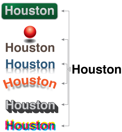
One vector, thousands of looks
 In this example, the word, “Houston” appears on the right in the default text style – black fill with no stroke. All of the examples to its left use the base vector object with different combinations of attributes and effects applied. (Set the view to “Outline” and all the objects look exactly the same. Set the view to “Preview” and each takes on a dramatically different appearance.) In fact, in this sample, if the word “Houston” needed to be changed to “San Antonio” all one would need to do is edit the text. Boxes, shadows, reflections, etcetera, would all be redrawn automatically as each letter was typed. This not only eliminates a lot of redundant work when something needs to be changed, but it is extremely useful when there are lots of items that require the same look. In fact once an object is linked to a style on the Graphic Styles panel, any changes made to that particular style would change every object in the document that had that style applied to it. Illustrator can even apply an graphic style to groups or layers too. This can be a little confusing, but the Appearance Panel has will list the current hierarchical at the top of the panel for the appearances shown below.
To see first-hand how these styles work, download the sample file from this link. Click on any one of the examples and open the Appearance Panel. Selecting any clickable item in the panel will open a separate dialog box to edit that attribute. Experiment with the settings (be sure the preview box is checked) and you’ll see how changing each parameter alters the appearance of each object.


