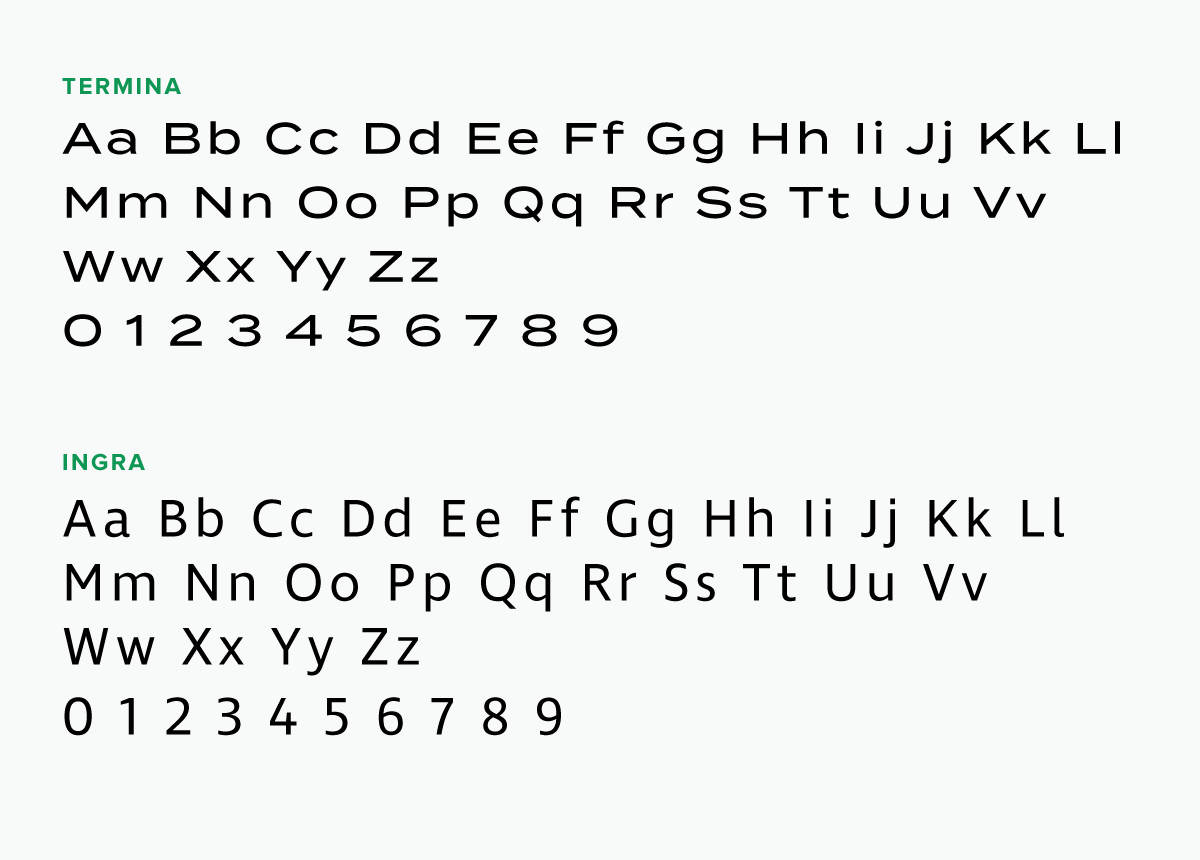
To complement the mark’s geometric shapes, we chose Termina, a typeface that not only reflects those characteristics but also retains its legibility at smaller sizes. We paired Termina with Ingra, an elegant and flexible typeface that looks good in print and on screen.
Launching LaRue Retail Advisors’ New Brand and Website
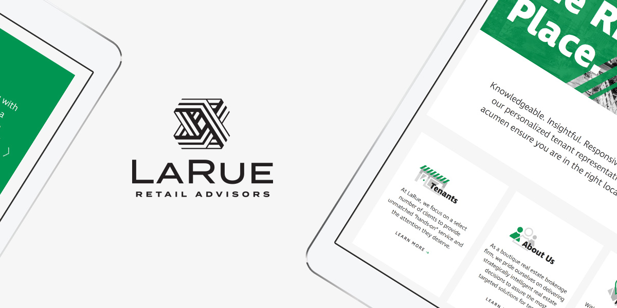
Established by John LaRue, a Houston-based real estate broker with more than 16 years of experience, LaRue Retail Advisors is a boutique real estate brokerage firm that focuses on the Houston, Austin, and San Antonio markets.
LaRue came to Herring with the need for an inspired brand in the highly competitive retail market.
Branding
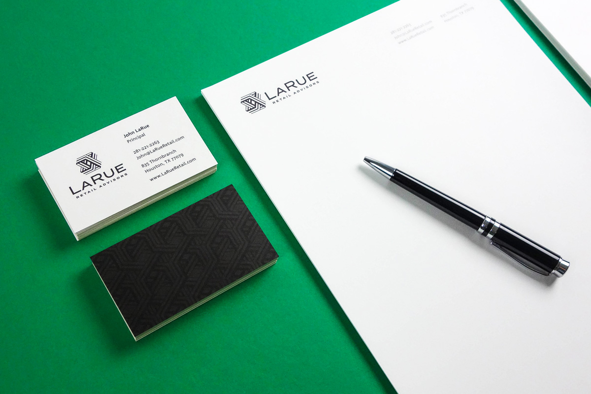
After the initial briefing, we recognized there was equity in the founder’s family name – LaRue. With a name in place, we proceeded with designing a sophisticated visual identity that builds on the firm’s philosophy of delivering exceptional service by dedicating time and energy to a select number of clients.
Logo
The diamond at the center of the mark represents LaRue’s focal point – their clients – and the dynamic shapes surrounding it imply and reinforce LaRue’s commitment to continually provide premium service to their clients.
Typography
Colors
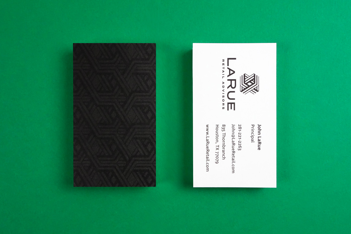
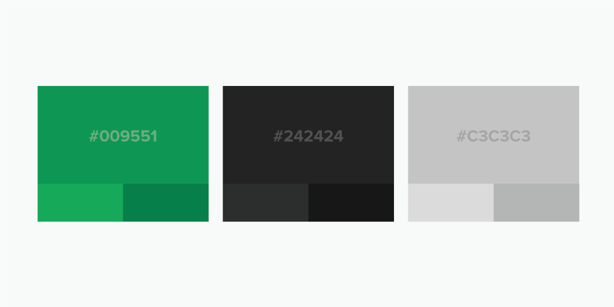
LaRue’s rich green and dark gray create a sophisticated and memorable pairing that helps build brand awareness across different platforms.
LaRue Website Design
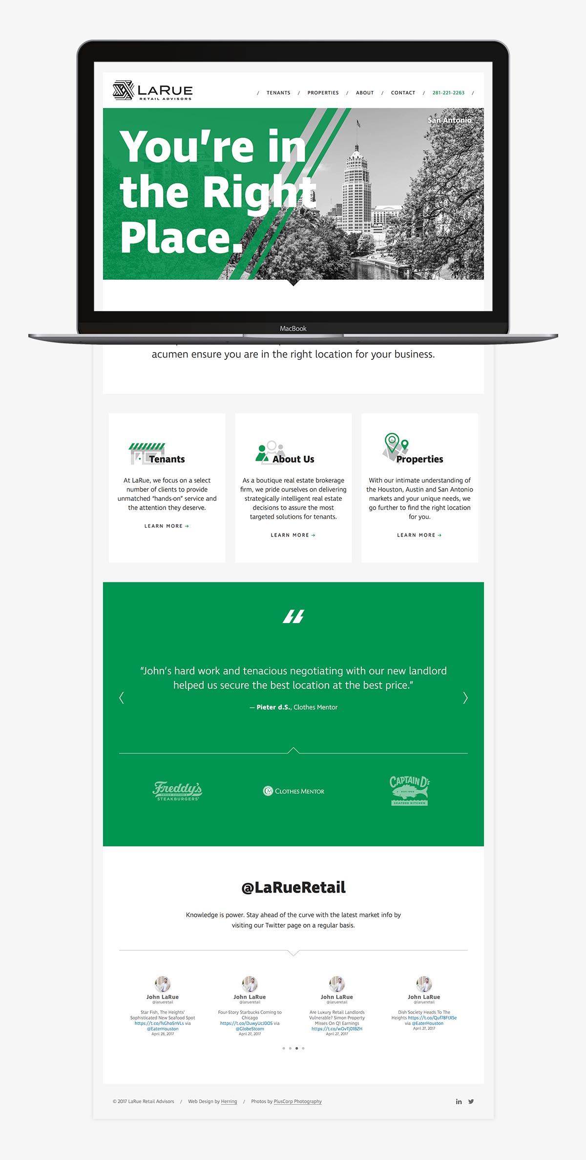
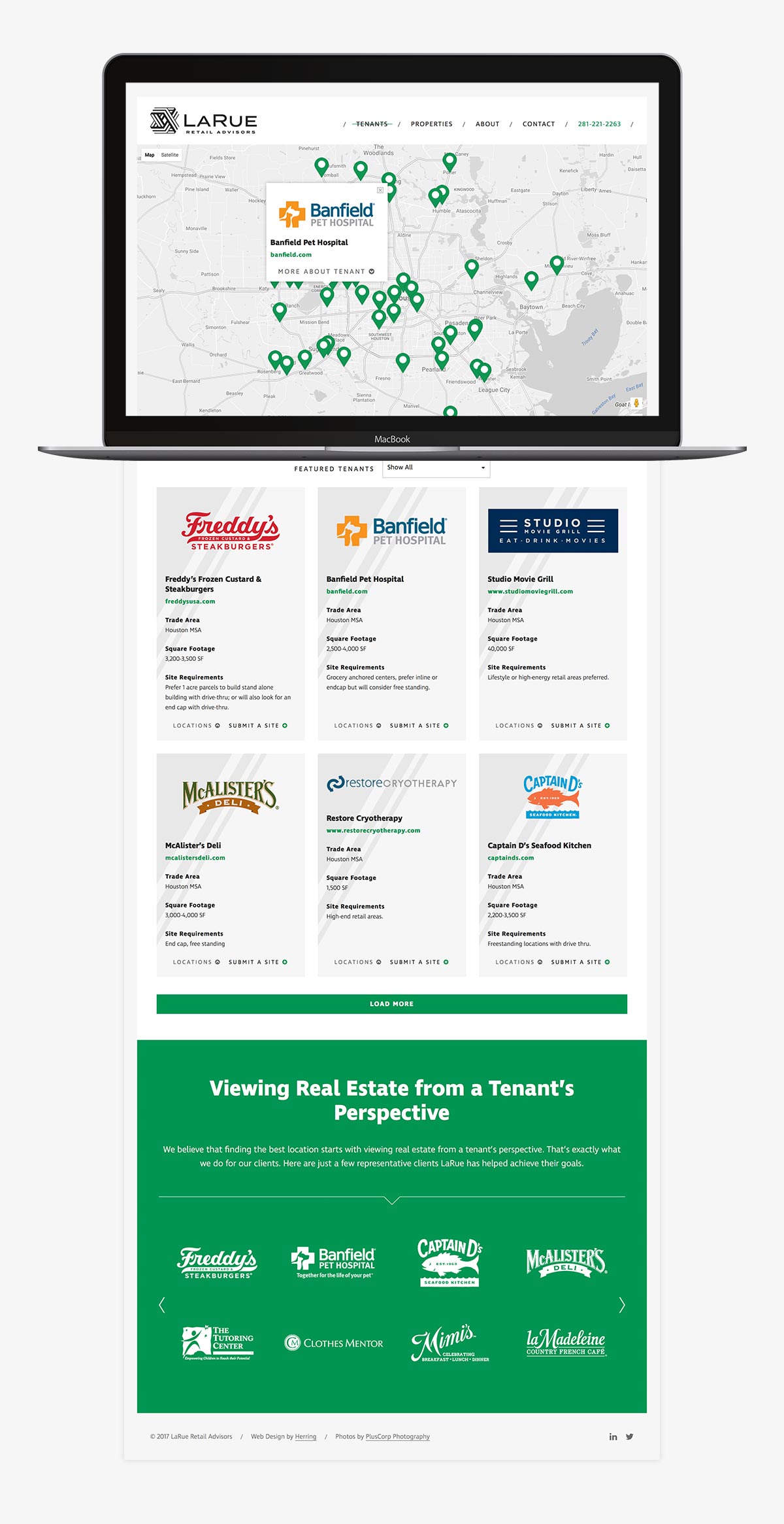
The next step was to establish LaRue’s online presence with a responsive website. Our main goal was to highlight the tenants LaRue represents and help connect them with the best location for their business.
Functionality
The Tenants page houses the site’s key functionality. Here, the user can:
Content Management
To give our client the ability to easily update this site on their own when necessary, we chose an open-source CMS (content management system) that provides full control over their maps, listings, text and images in a user-friendly interface.
Messaging
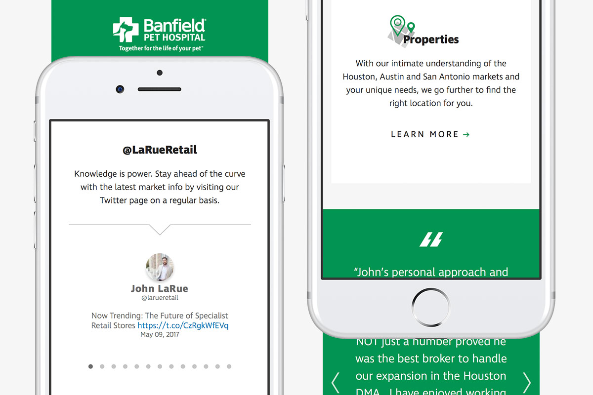
To make the user experience simple yet impactful, we worked with the client to develop short and effective messaging that directs visitors to the information they are looking for. Throughout the site, we put emphasis on LaRue’s extensive experience in the real estate market, knowledge base and personal approach to help set the firm apart from the competition.
Icons
We reinforced the messaging with visual hooks – custom graphics that draw their inspiration from the angles found in the logo.


