A key message point for Hagler is a brief introduction to the company’s culture. As a small, independent EPC company, Hagler Systems has to instill confidence in the market with its ability to take on large projects. We made sure to discuss their customer-centric approach through their enterprise-level project management system and technologies, their use of lean manufacturing and lean thinking processes, and their hands-on approach to each project.
Growing Hagler Systems’ Brand With New Website and Messaging
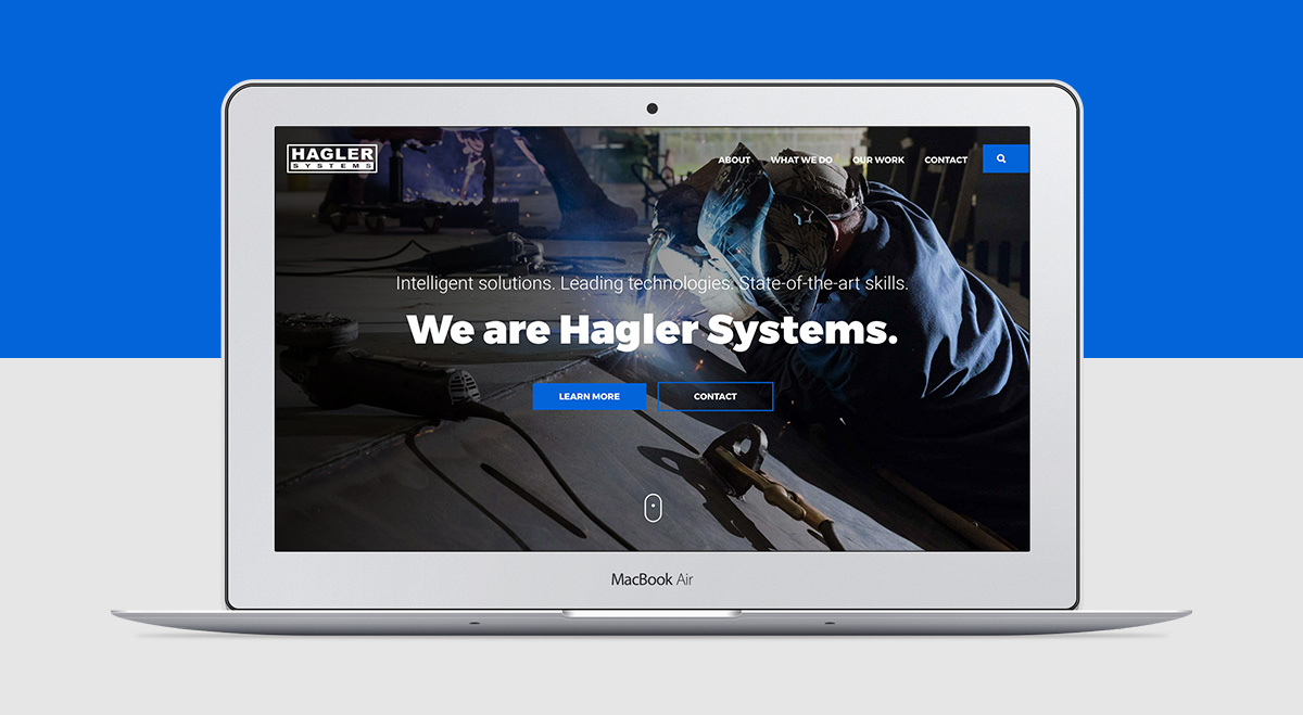
Founded in 1996, Hagler Systems is an EPC company that provides engineering consulting, manufacturing, project delivery, and asset management solutions to clients — sectors as varied as oil & gas, dredging, phosphate mining, sand & gravel, and more.
Hagler Systems looked to Herring to help them update their brand messaging and website design. The update would showcase their full scope of services that they have fine-tuned over the company’s 20-year history.
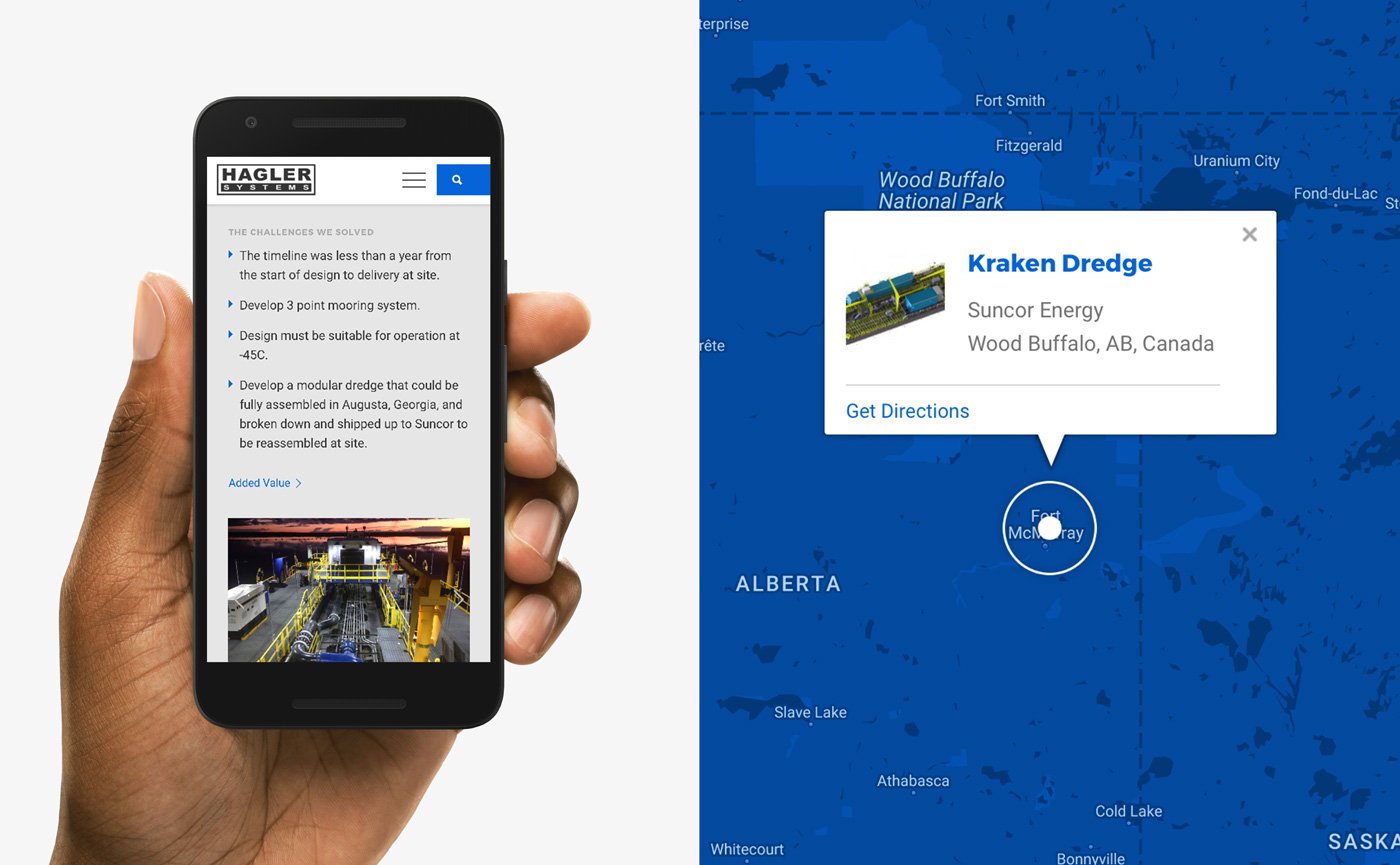
No Project Too Big
Website Design and Development Process
Main Objectives
- Tell Hagler Systems’ story in a modern, engaging and coherent way;
- Build on Hagler Systems existing brand elements to increase brand equity and recognition;
- Improve user experience (UX) with straightforward navigation, clear language and impactful photography and graphics;
- Create a Case Studies feature that allows Hagler to showcase their latest projects as soon as they are completed;
- Provide a fully responsive website backed by a versatile content management system (CMS).
Phase 1: Temporary Site
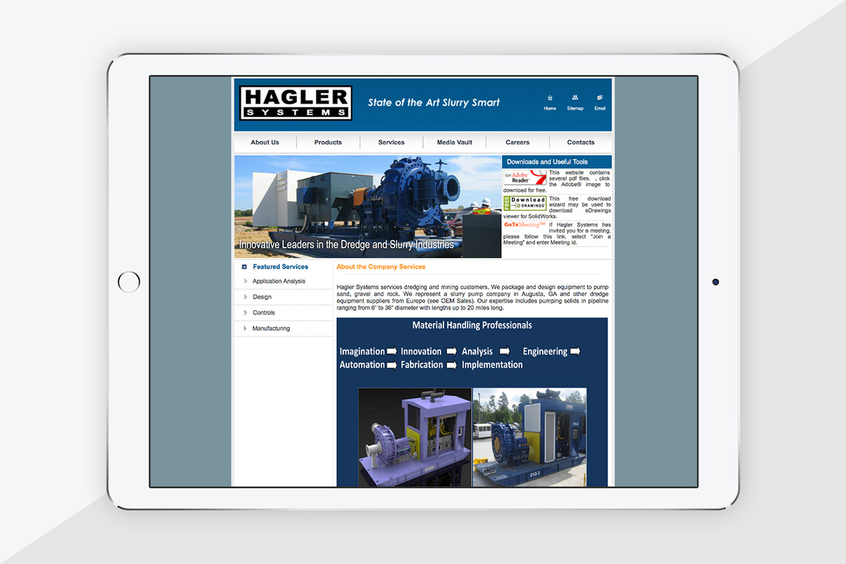
Hagler Systems needed their old site replaced as soon as possible because its outdated look and messaging did not represent the company’s full range of capabilities and turned away prospective clients. To fill the need without compromising our web design process, we quickly designed and launched a temporary one-page website that offered up-to-date information and invited visitors to contact the company.
Phase 2: Full Site
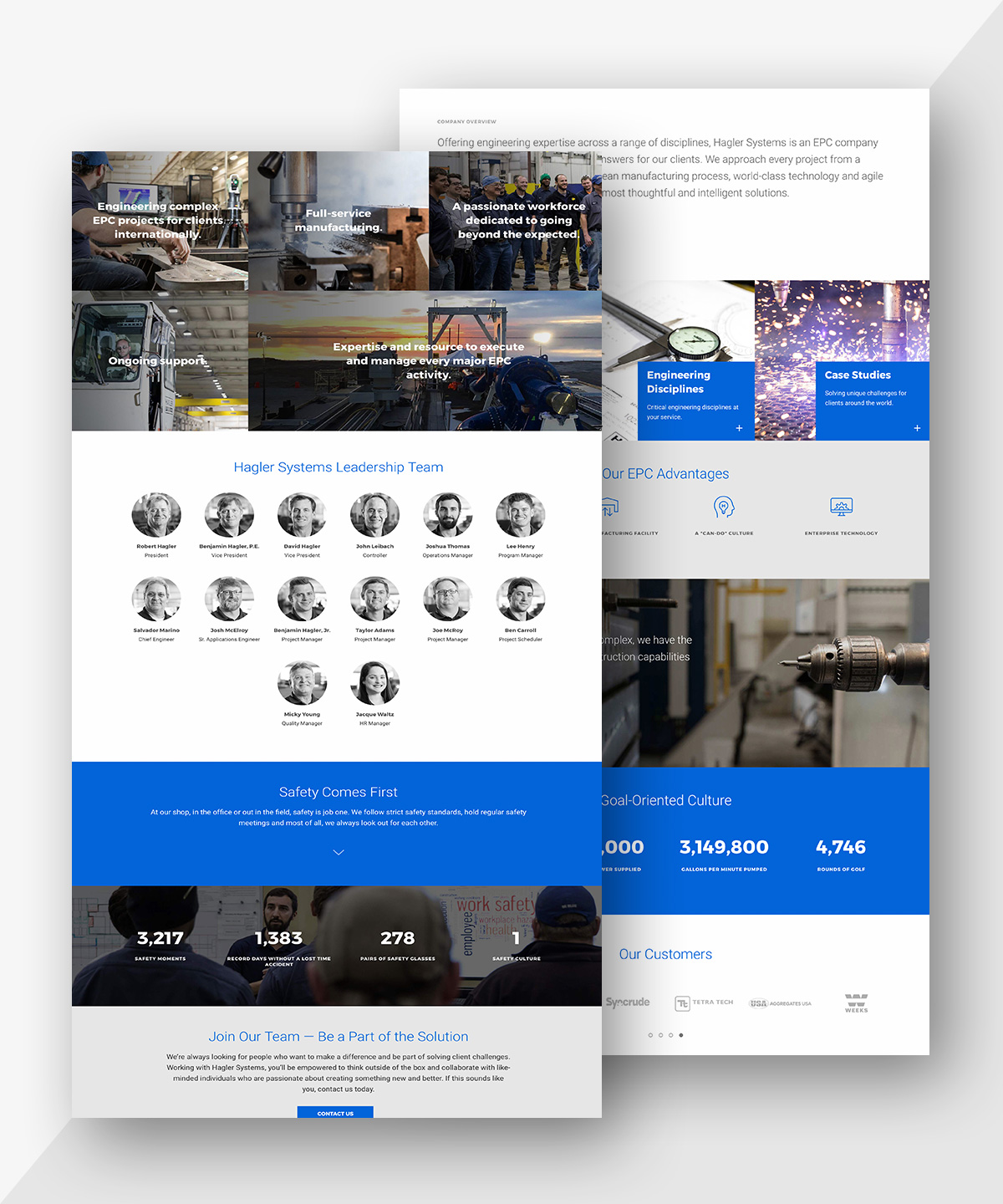
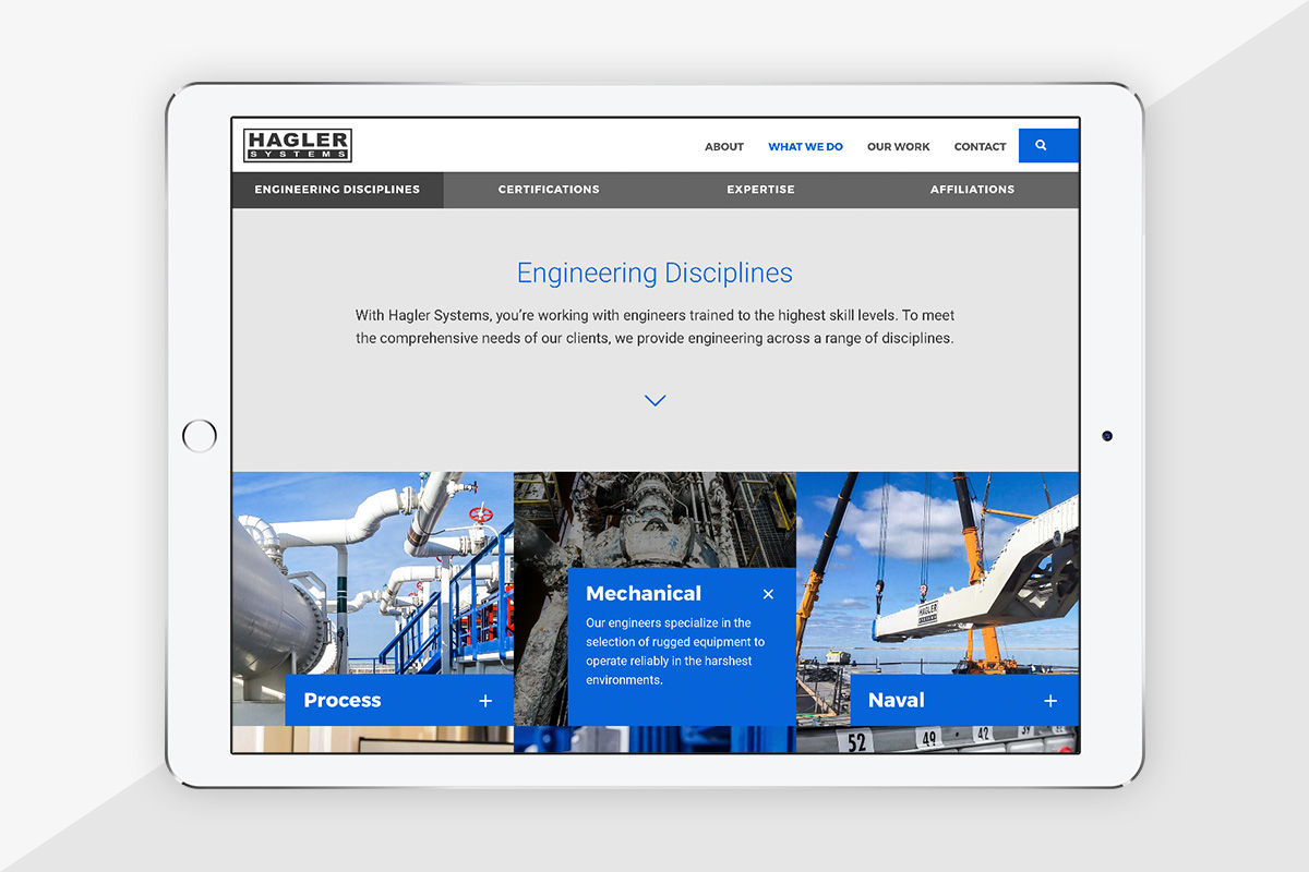
With the temporary page in place, we had time to carefully consider and address all of the new website’s objectives set during the extensive client interviews. An absolute must-have for Hagler Systems was a clean modern look that utilizes current design and development trends — such as responsive full-width layout and subtle animations — to stay ahead of the company’s online competition, build visitors’ interest and help them navigate the site.
Brand Elements
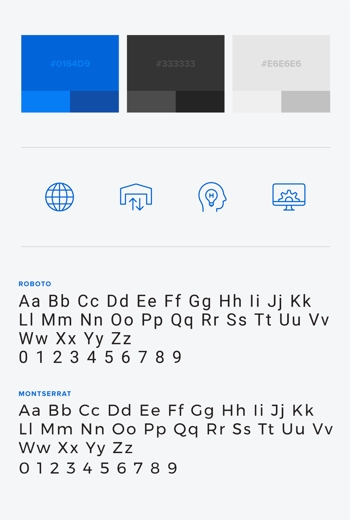
To reinforce Hagler Systems’ existing brand, we used Hagler Blue as the leading visual hook throughout the site. The blue symbolizes the company’s mission to continuously improve and innovate, and is the primary color of Hagler-manufactured equipment.
We further enforced the brand with four custom icons which illustrate Hagler Systems’ EPC advantages. To complete the look, we selected web-friendly typefaces — Montserrat and Roboto — that are fast-loading and legible across multiple digital platforms.
Responsive Website Design
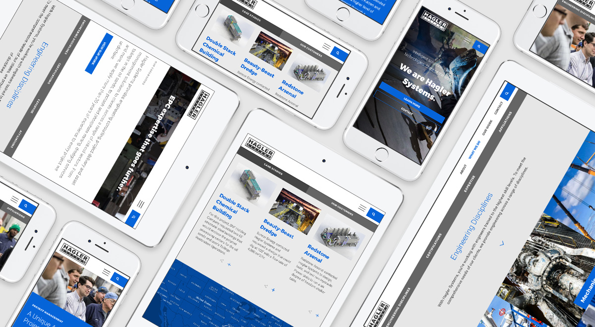
As with all websites we design, haglersystems.com is fully responsive, which removes the need for a separate mobile site — all content effortlessly adjusts to a user’s screen size, making all information readable and accessible from any device.
Content Management
WordPress, the open-source content management system we chose for this website, ensures that the client is able to create new content, such as case studies, and make timely updates without outside help.


