Texas International Terminals
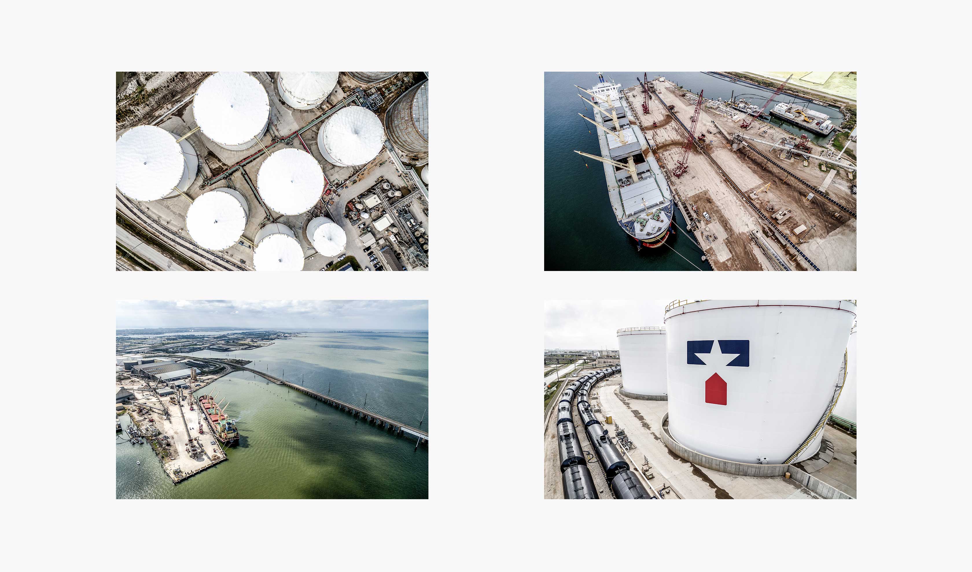
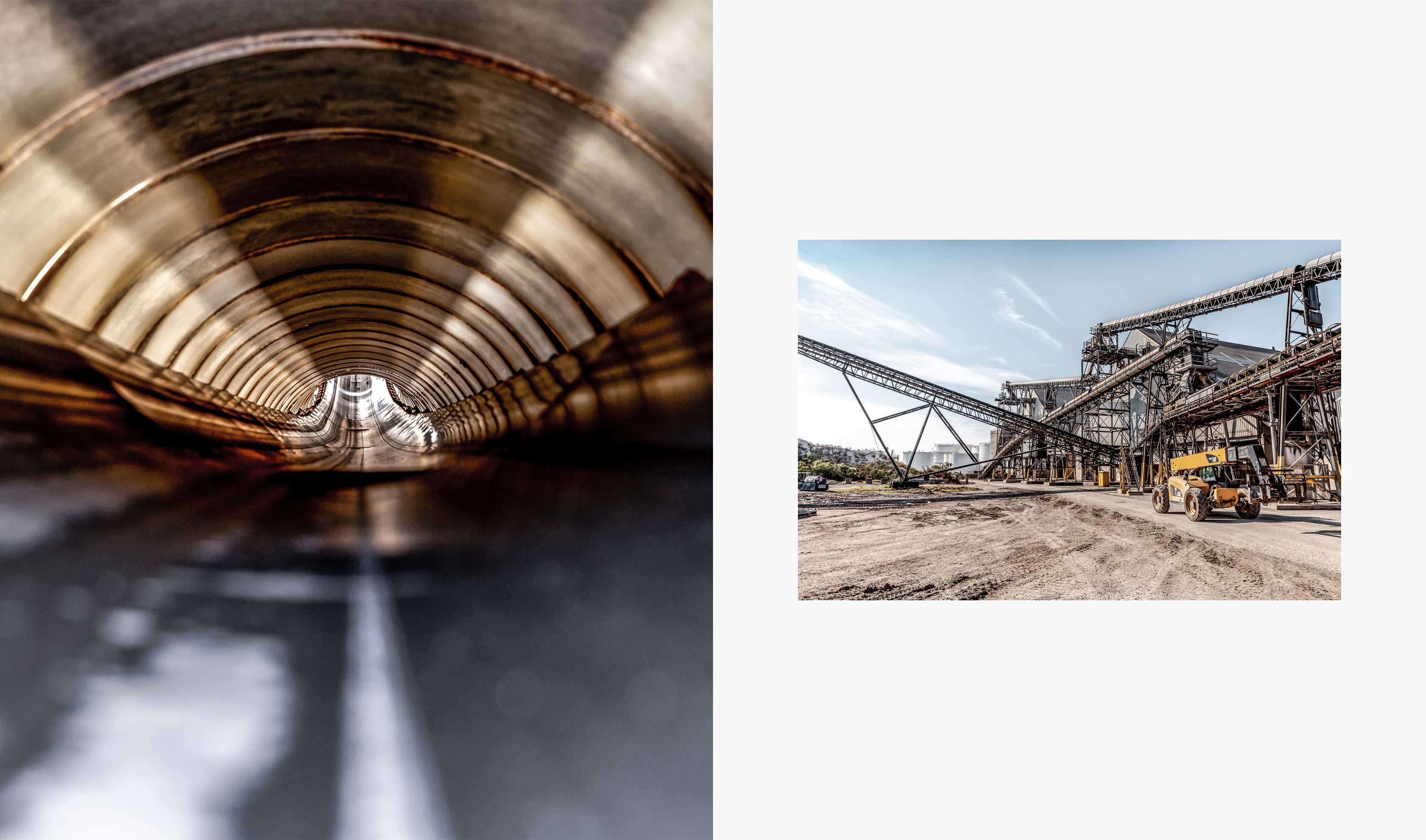
Texas International Terminals is a world-class liquid and dry bulk multi-modal facility for deep draft vessels, unit trains, manifest rail, barge, and trucking along the Galveston Ship Channel. Their single location links the continental United States with the global market. Texas International Terminals asked Herring to conceptualize and design a refreshed brand that would reposition the company as a proactive and versatile shipping option for an international audience.
Our Services
- Brand Positioning
- Brand Implementation
- Logo Design
- Brand Voice & Messaging
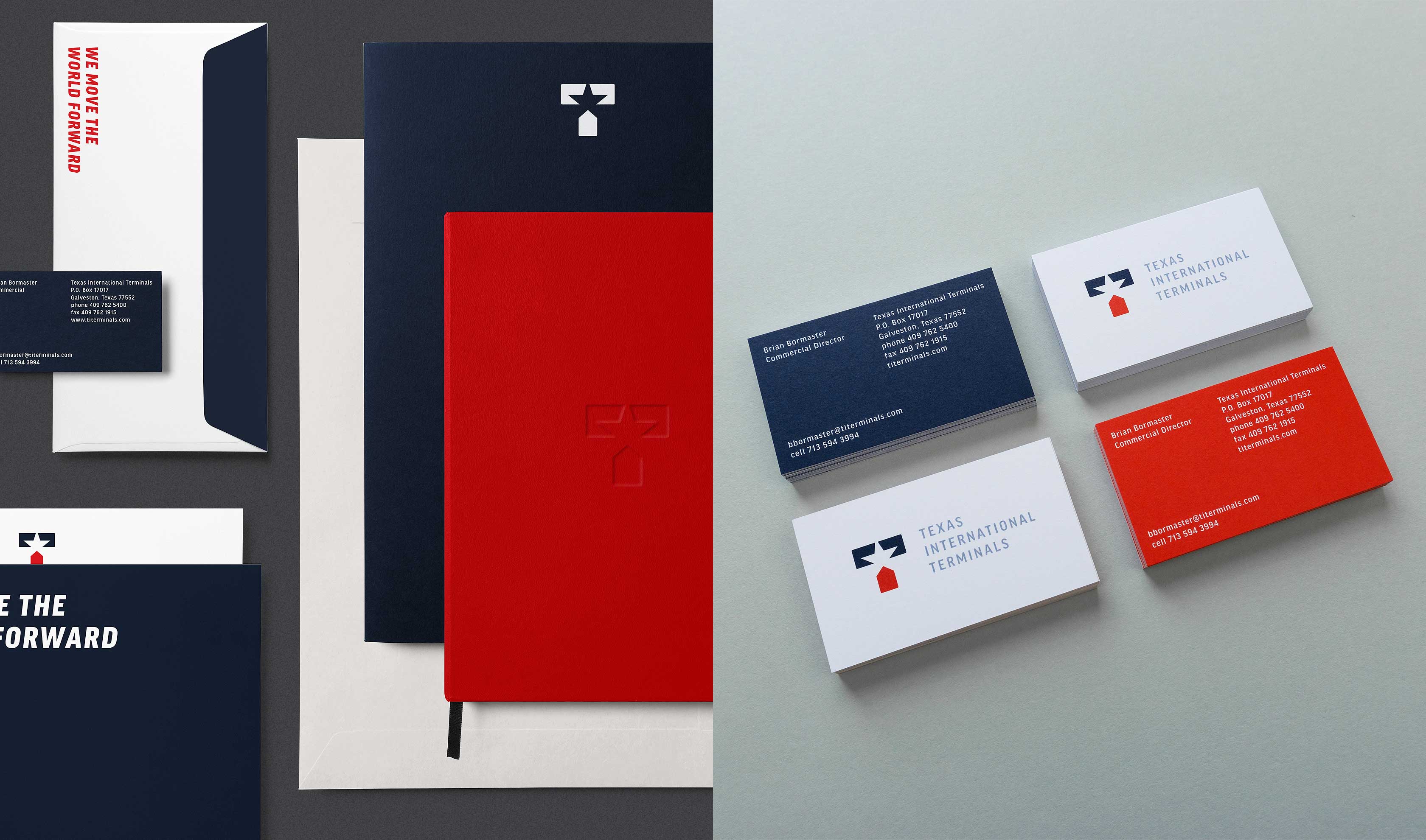
- Visual Identity System
- Brand Guidelines
- Content Direction
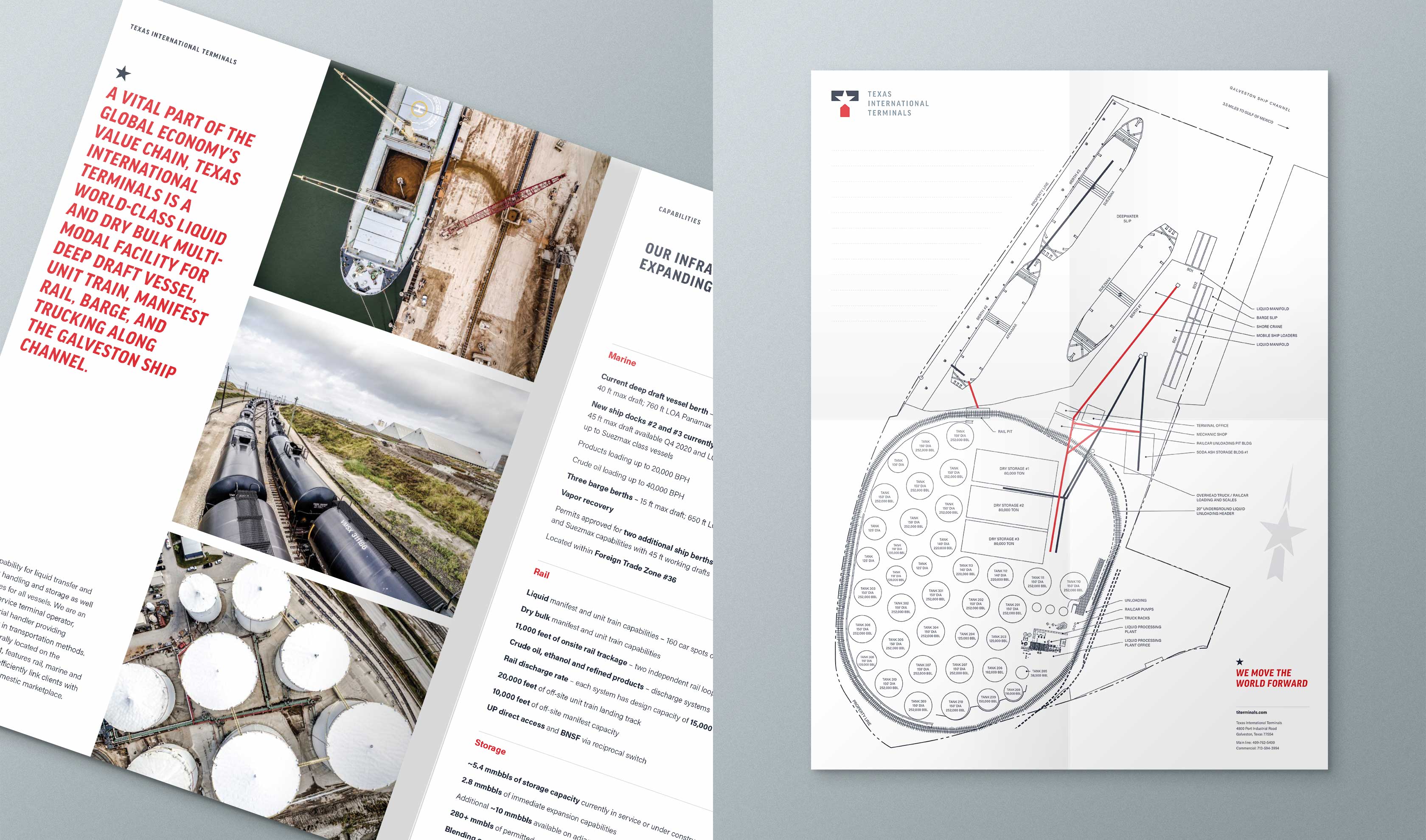
- Printed Communications
Sharing a new and clear message
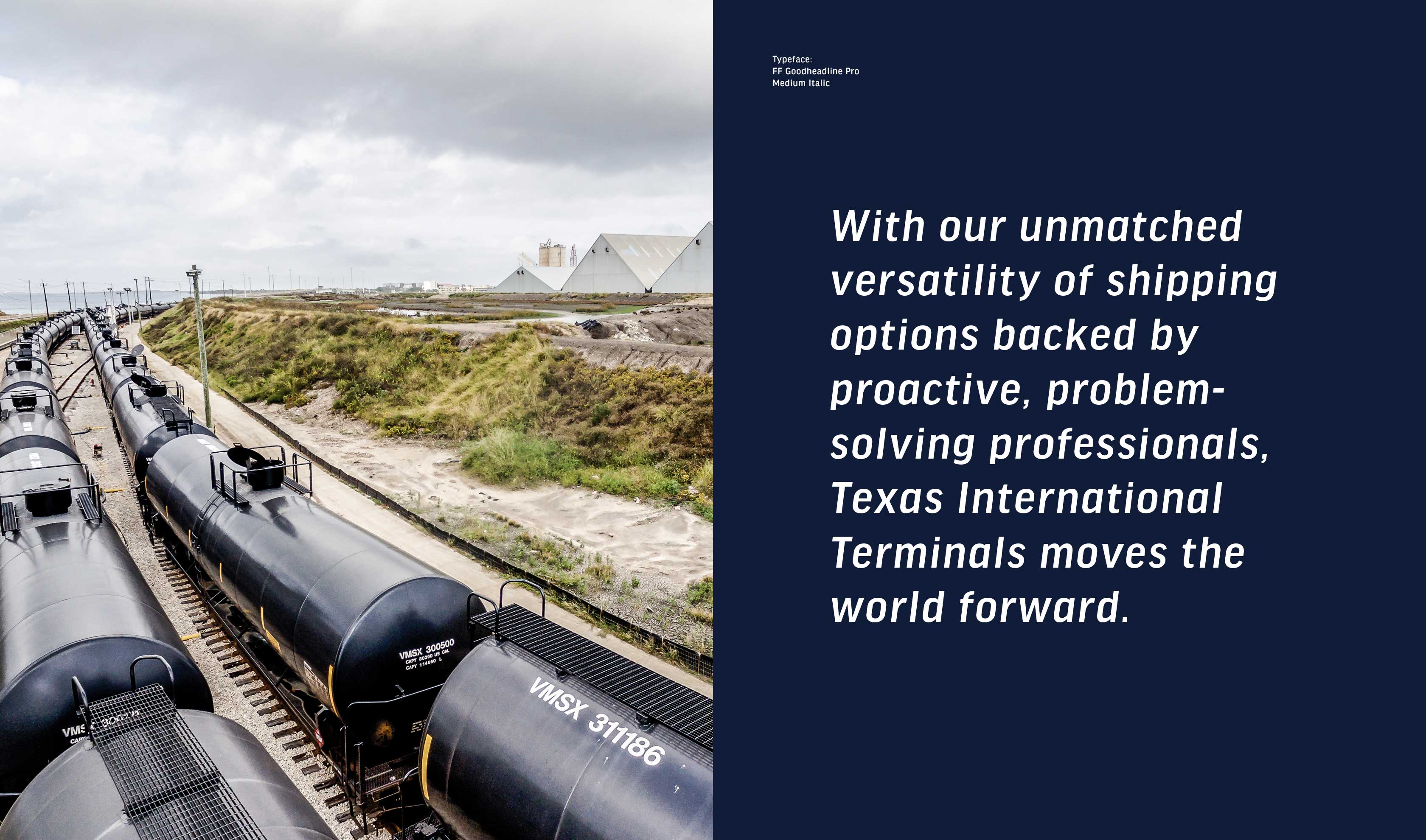
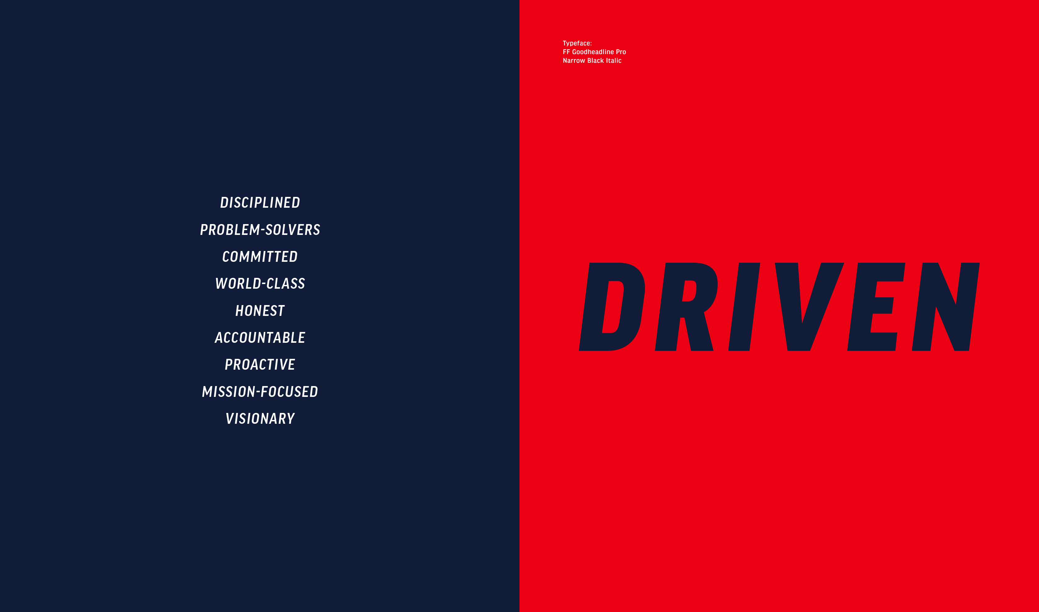
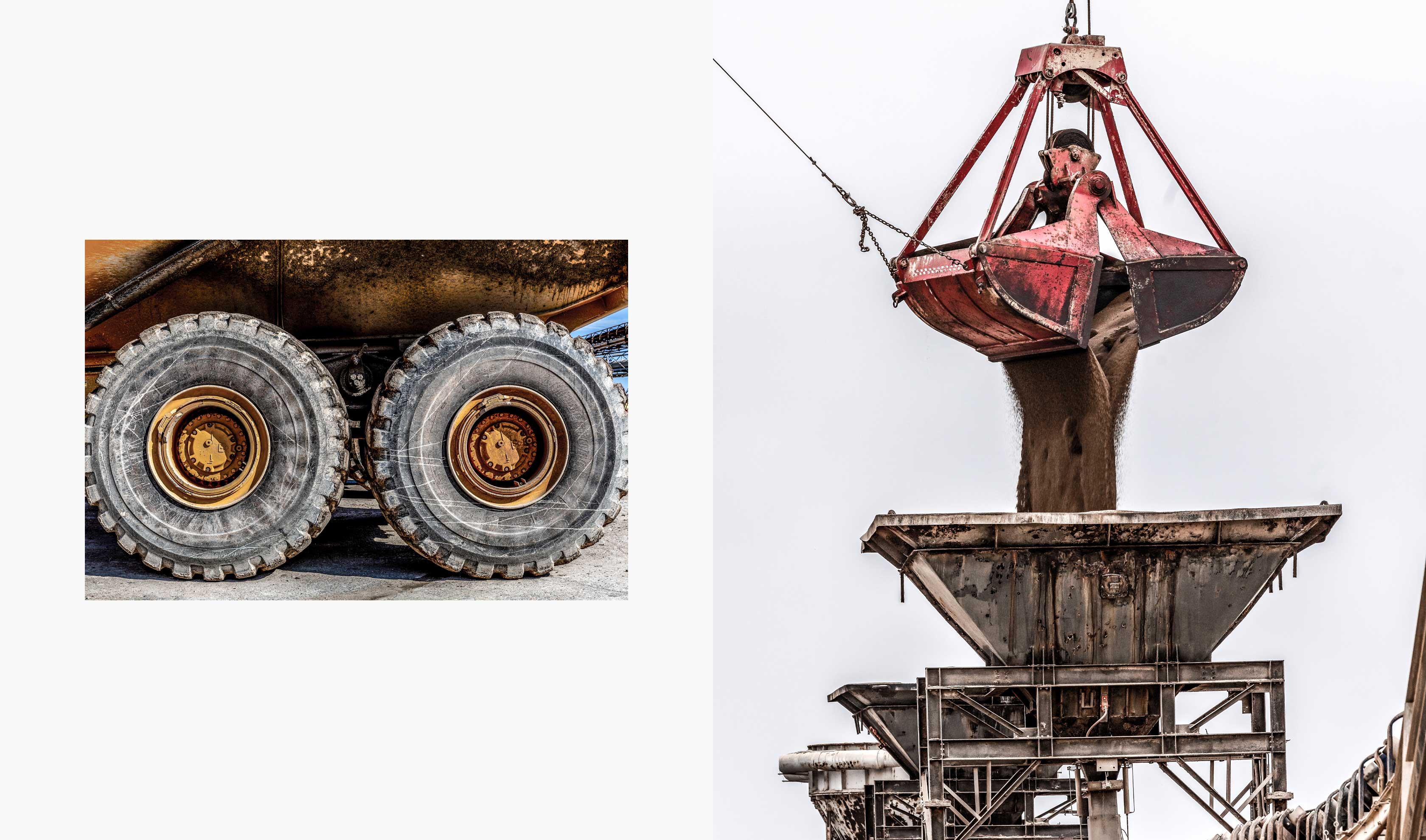
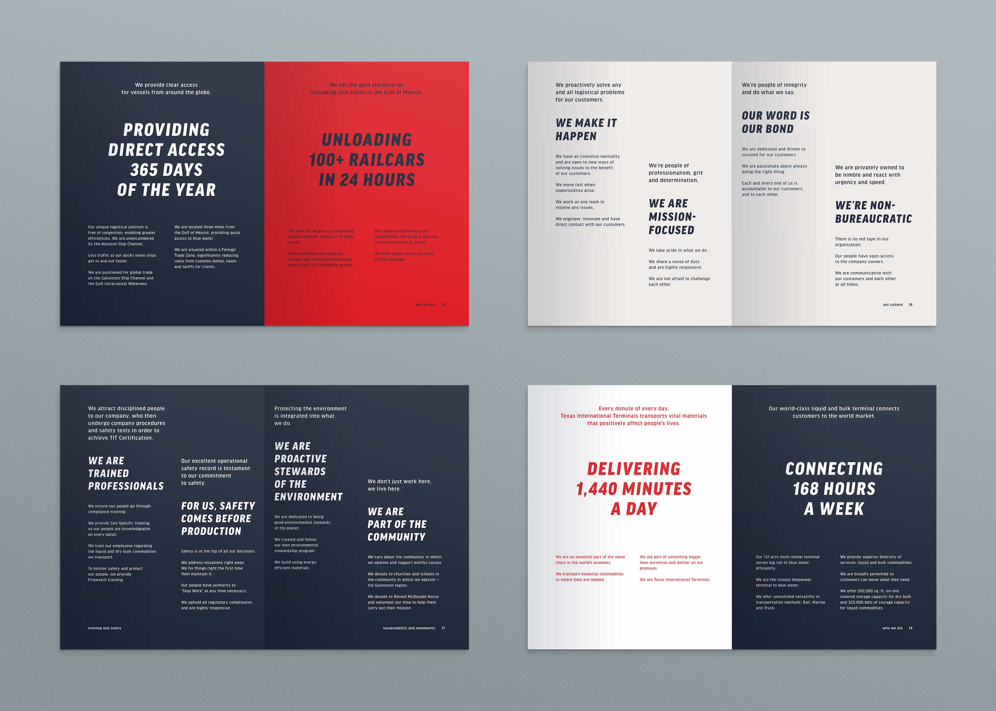
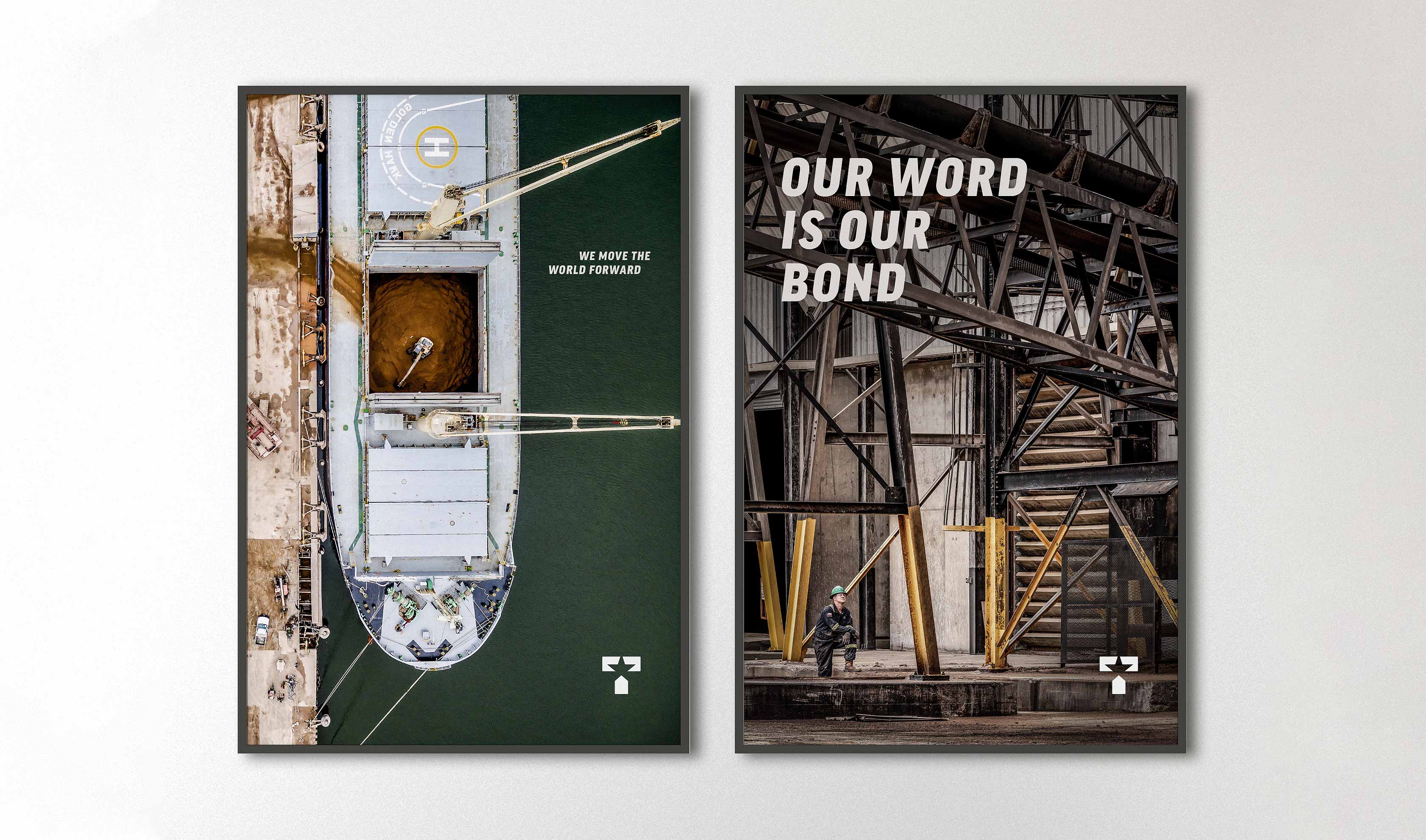
Along with touring the facility, Herring conducted interviews with the leadership and employees at various management levels. Our goal was to develop a messaging platform for the company to build off of and be flexible enough to be used across various materials internally and externally. We listened and gathered critical information that was needed to shape the correct brand voice. Herring clarified key messages and produced brand touchpoints that reflected the company’s world-class team and conveyed their essential role in the global economy. While touring the facility, we were able to see how the new visual identity would be applied in real-world situations like clothing, marketing materials and storage tanks. This helped to inform how we would design the logo for ease of use across multiple mediums.
Revitalizing an outdated identity
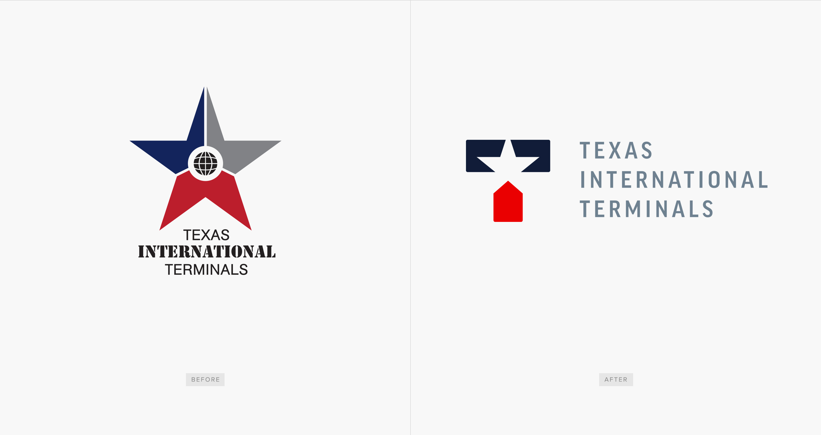
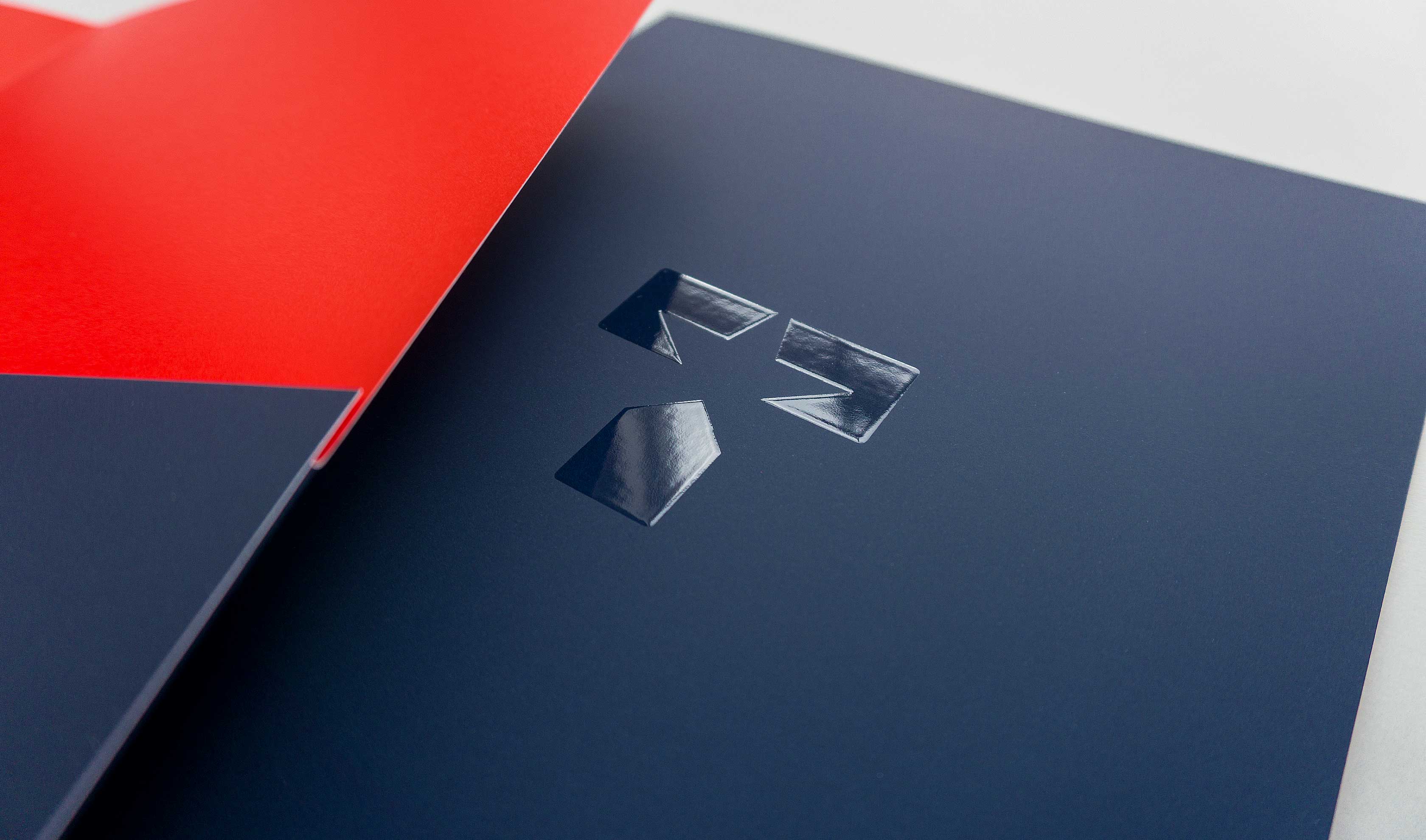
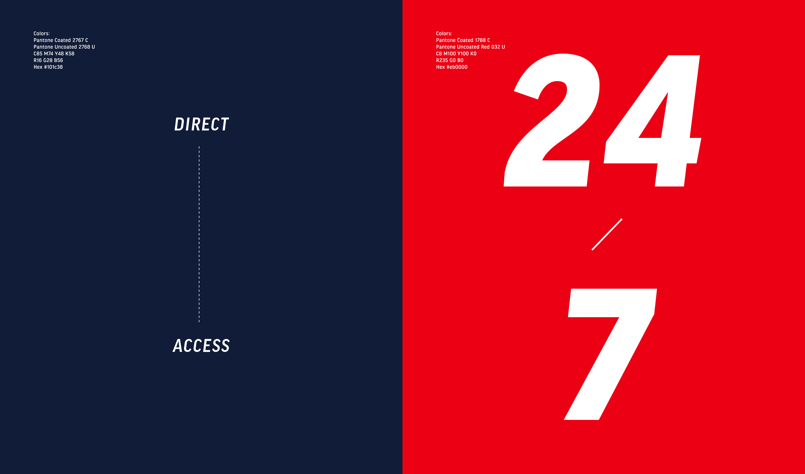
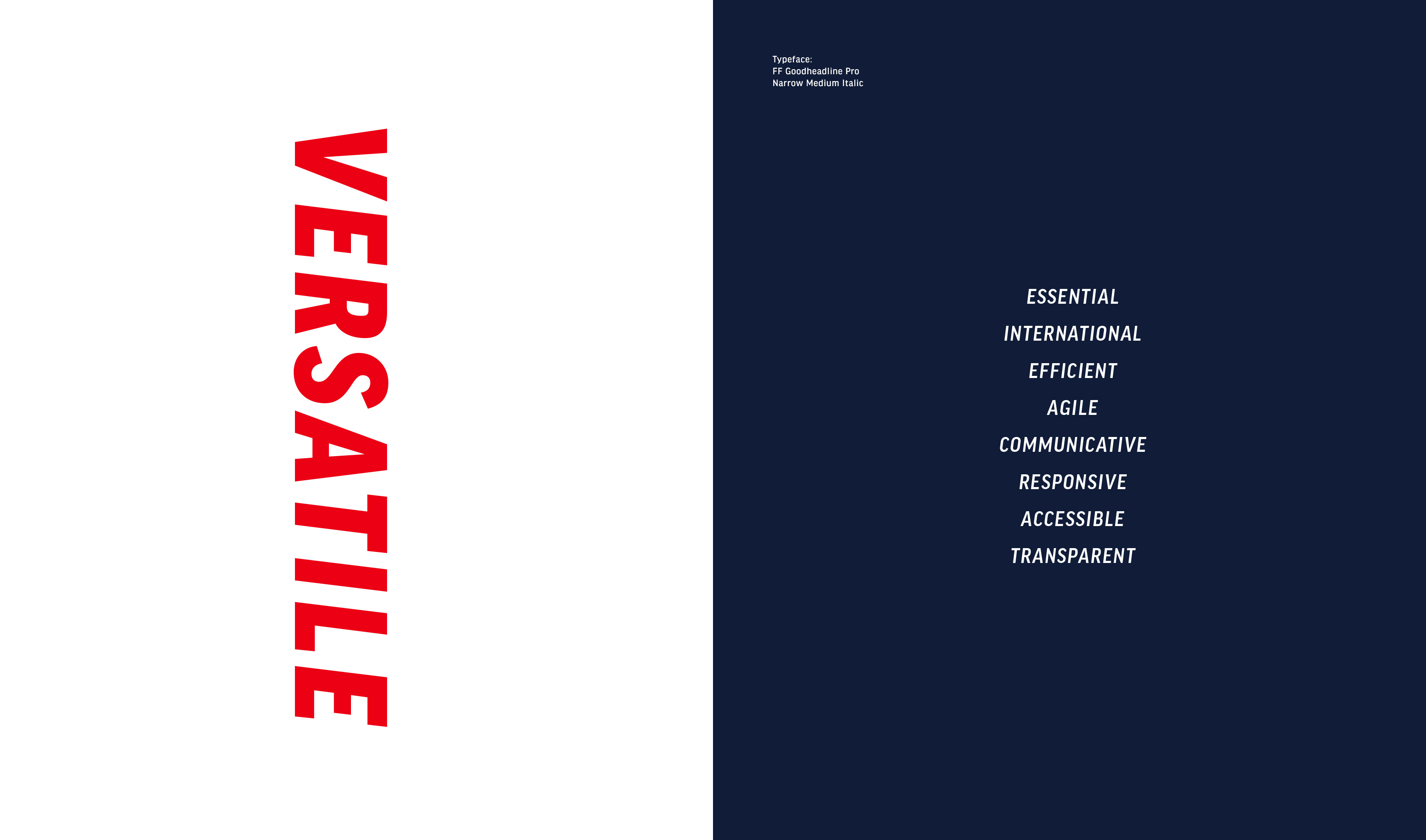
Lacking modern qualities, the previous identity was generic and didn’t share any of the culture or personality of who Texas International Terminals is now. While maintaining the spirit of the original mark, Herring was able to craft a new design that was modern and iconic. We wanted the new logo to be adaptable to a singular color if needed and be easily applied to a variety of materials like fabric and the side of holding tanks. By using the positive and negative space, we were able to create a “T” that references the name and location of the company; a star which highlights Texas but is also a part of their previous logo; and the bottom segment of the “T” looks like a ship coming into a dock. Herring strengthened the color palette and typography for an overall prideful and impactful impression.
